
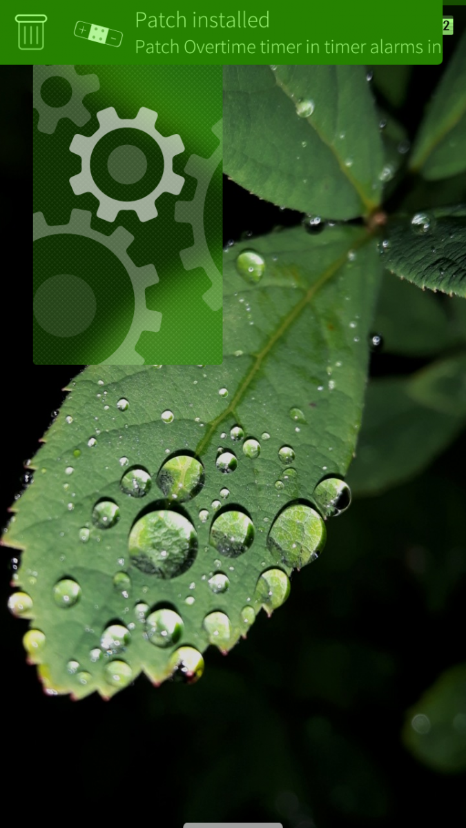
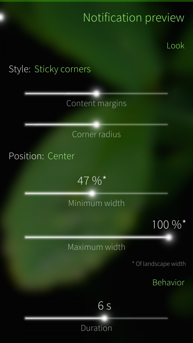
Patch: Improved notification preview

Moves a bit enlarged icon inside the notification bubble and provides settings to customize notification preview's look and behavior.
You can determine
- Style of the preview
- Margin and corner radius (if selected style permits)
- Maximum and minimum width
- Duration which the preview is shown
- What tapping the preview and swiping it left, right and/or down does.
No more waiting for notifications to time-out out of the way or gathering useless notifications to the events view.
Currently, removing does not work with email notifications. It has probably something to do with notification's email address headers as normally the header is the app's name.
Requires Patchmanager.
You can help translate the patch to your own language on Transifex.
Donations are welcome:

Screenshots:
Category:
Application versions:
Changelog:
* Thu Nov 7 2019 0.4.5-1
- Fix for 3.2.0.12
- Chinese translation, thanks to 天苯
* Tue Jan 8 2019 0.4.4-3
- Fix for 3.0.1.11
* Tue Nov 6 2018 0.4.4-2
- Fix for Sailfish 3
- Updated Spanish translation
* Mon Oct 15 2018 0.4.4-1
- Content margins setting
- German translation, thanks to sail_parleur
* Mon Jun 25 2018 Thaodan <theodorstormgrade@gmail.com> 0.4.3-2 (Reverted a bit for familiarity)
move changelog to seperate file (recommended by Packaging/Guidelines)fix building in clean build environment, because qmake5 was not installed (missing qt5-qtcore)- Added URL tag as suggested by rpmlint-- Shortened Summary as suggested by rpmlint
-* Fri Jun 1 2018 0.4.3-1
- Fix for 2.2.0.29
* Fri Feb 23 2018 0.4.2-2
- French and Russian translations, thanks to Guesnery and Ancelad
* Fri Feb 23 2018 0.4.2-1
- Fix for 2.1.4.13
* Sat Nov 4 2017 0.4.1-4
- Fix for 2.1.0.11 (and possibly earlier versions)
* Fri Nov 2 2017 0.4.1-2
- Spanish translation, thanks to Caballlero
* Mon Oct 16 2017 0.4.1
- Duration setting
- Small fixes
* Fri Oct 13 2017 0.4
- Settings page with lot of customation options
- Bugfixes
* Tue Jul 25 2017 0.3
- Soft corner only if it doesn't face the side of the screen
- Notification preview's width is determined by the body text
- Mimimum preview width is 80% of the portrait-screen-width
- Maximum is full screen width
* Sat Jul 15 2017 0.2
- Changed patch for overall notification preview improvement patch.
- Portrait-screen-wide notification
- Icon moved inside notification bubble and enlarged
- Reduced the margins restricting preview texts a bit
* Sat Jul 15 2017 0.1
- First build.
Comments
olf
Sat, 2017/07/29 - 01:05
Permalink
Thanks, that would be nice.
And take your time, as this is a really minor flaw (which rarely occurs).
naytsyrhc
Wed, 2017/07/26 - 11:02
Permalink
This is really a very nice improvement. For me the notifications now look more integrated and more "sailfish-like" than before. As if the look should have been like that from the beginning. I'd suggest to make something like a "pull request" on sailfish sources in order to get that into official system without patch. Well done and many thanks!
Ingvix
Wed, 2017/07/26 - 09:35
Permalink
The sharp corners are like that by design as said in the changelog. The round corners were the reason I didn't like it anchored to the right so I though I could make the corners facing the screen sides sharp so they seem attached to the sides.
I was thinking of making the remaining soft corner more round but did not end up doing it at least for this release. It's true that it would increase the distinctiveness from the others so you wouldn't think so easily what you just did, that part of the preview would be left out of the screen. And look better in general too. Maybe I try to create some setting for the next release so every one could make the preview just like they want to.
olf
Tue, 2017/10/03 - 04:49
Permalink
After using "Improved notification preview" for a while and reconsidering the layout options, I absolutely concur with your current (as of v0.3-1) design choices, especially WRT:
Thus the only remaining layout suggestion I still have is to make the single "soft corner" a bit "rounder" (i.e. to increase its radius), as you already considered.
Side note: While having a look at Jolla's original notification preview on somebody else's SailfishOS device a few days ago, the vast improvement in readability and much better look of your "Improved notification preview" (which I already gotten used to so much, that I only faintly remembered the original) became immediately apparent.
Kudos to you for this!
olf
Thu, 2017/07/27 - 03:00
Permalink
Oops, did not see this message from you until now (should have reloaded page in browser) and updated my last message below, meanwhile.
No, there is no need for a settings page, which needs efforts to create and maintain, while IMO being unnecessary for a small Patch / UI change like this.
Look, IMHO *this* discussion thread is defining the (one and only) settings for "Improved notification preview": Anyone can criticise your design decisions (like I did), discuss with you, try to convince you with reasonable arguments, ... but ultimately you decide (as "Improved notification preview" is your baby). This process sets the look & feel, and has IMO already resulted in a balanced design.
fravaccaro
Thu, 2017/07/27 - 03:16
Permalink
I don't want to sound rude, but why would there be no need for a settings page? You're ok with 0.3, I was ok with 0.2 (no, I don't like the new left-anchored design) and the author himself couldn't make up his mind between a couple of different design choices (namely landscape width, margins and corners).
So, assuming he's up for it (as I stated I'd be glad to help), the patch could only benefit from a settings page.
fravaccaro
Sun, 2017/07/23 - 22:08
Permalink
I'm not sure rounded corners would fit tho, assuming Ingvix wants to follow the remorse pop-up look
Ingvix
Mon, 2017/07/24 - 21:42
Permalink
I sort if like it with the round corners after all. I'm not really going fo the remorse pop-up look but just a more practical and aestetic on the side if possible. If I was enough experienced I could make a setting page so you can select your own look but maybe in the future.
fravaccaro
Mon, 2017/07/24 - 23:56
Permalink
Settings page is doable by using ConfigurationGroup. E.g. for the corner radius, instead of a fixed value you put the name of the dconf key which can be changed via a jolla-settings plugin (it is a pretty standard qml page installed in a specific path).
Ingvix
Tue, 2017/07/25 - 08:56
Permalink
I tried to use it before in another project but I couldn't figure out how to create a new dconf key for my needs. Guess I need to look again.
fravaccaro
Tue, 2017/07/25 - 17:18
Permalink
I don't know a lot but it works for my needs :) if you need any help you can pm me
fravaccaro
Sun, 2017/07/23 - 21:04
Permalink
The new look is lovely :) it resembles more the remorse pop-up, I like this coherence :)
olf
Sun, 2017/07/23 - 19:14
Permalink
Cool, an excellent UI improvement!
@Ingvx, your design choices are absolutely right, IMO: Rounded corners and *not*-full-screen-width in landscape orientation, to clearly distinguish notifications from UI elements with rectangular corners, which take the full screen width (e.g. remorse timers). Otherwise this would be confusing.
The improvements in detail of v0.2 (e.g. enlarged icon within the notification and smaller text margins) makes this Patch's look & feel just perfect (for me)!
But as horizontal space in these transient notification bubbles is usually too scarce (i.e. the lower text line much too long to fit into the notification bubble, so the second line starts scrolling after a moment, but then the notification already vanishes, making it impossible to read the full text), I am thinking about ways to enlarge this space.
If it is technically possible to use different notification bubble widths for portrait and landscape orientation, I suggest letting the notification bubble always start in the upper left corner of the screen (in both, portrait and landscape orientation), but while using the full screen width in portrait, only use >=75% of the screen width in landscape orientation (note, it has to be at least 75% to provide more space even on screens with 4:3 aspect ratio).
If this is technically impossible, then this Patch is basically "final" in its current look (as of v0.2), IMO. :)
Ingvix
Sun, 2017/07/23 - 20:49
Permalink
I believe it can be done but why 75% and not full landscape screen width? And I feel that if it doesn't fill the whole width it would look prettier in the center, especially now that the icon is located inside the bubble and does not work as a certain kind of visual anchor which would make it work for the notification to start from the left corner. As the preview is more symmetrical now, it feels more natural it to be in the center of the screen.
olf
Sun, 2017/07/23 - 21:24
Permalink
True, so go for the full screen width of the notification bubbles in portrait *and* landscape orientation, as this provides a consistent look & feel for both orientations (as you correctly pointed out) and fully utilises the available horizontal space (as @fravaccaro already suggested, but with rounded corners).
Yes, that would create a lot of empty space on the right side within the bubble for very short notifications, but IMO the ability to read the text of long notifications outweighs this by far.
BTW, on my Jolla 1 phone under SailfishOS 2.1.0.11, the notification bubbles are not exactly centered with v0.2, but slightly shifted to the right in landscape orientation.
Thinking about it (and imagining how that looks), this is clearly better than the current somewhat centered look in landscape orientation (as of v0.2) and the original off-center, anchored in the upper left screen corner look (which I suggested to bring back in landscape orientation).
Ingvix
Sun, 2017/07/23 - 22:21
Permalink
I checked the case on my old Jolla1 and the preview was right in the middle in landscape mode. See my screenshot here. Could it be that your eyes just played a trick on you there?
I was also wondering if it'd be good idea if in landscape mode the notification preview would be as wide as needed for the text to be fully visible, maximum width of course being the maximum landscape width. Minimum could be the portrait width. This would overcome the aestetic problem when the preview width would be the screen width in landscape mode and and notification text would be short and there'd be a lot of empty space which would look a bit ugly.
olf
Mon, 2017/07/24 - 02:21
Permalink
a. Well in your screenshot the notification bubble (= notification preview) is obviously (literally!) centered, but on my two Jolla 1 phones not (slightly shifted to the right). But I have tons of Patches installed.
b. Oh, that sounds perfect, if variable width notification bubbles are easily feasible. I originally considered this being more complicated than necessary.
But then please anchor the notification bubbles in the upper left screen corner (again), as they otherwise would be "jumping" in width (depending on the actual text length) to the left and right side, each time a notification bubble appears. This way the left edge of the notification bubbles (with the icon and header text) would still always be at a fixed position.
And this visual scheme (i.e. anchoring and horizontal layout of the notification bubbles) is generic enough to be applicable to both, portrait and landscape orientation (so no separate code paths are needed, only the actual screen width as upper limit of the notification bubble width). :)
Ingvix
Mon, 2017/07/24 - 21:39
Permalink
I sort of like it better in the center but I guess I can make two releases of it. One emerging from the side and other from the center. Though it's currently a bit impractical if installed from an app where you can only install the latest release but I have high hopes that Storeman app would later allow to choose which version or release to download and install. For your convenience I can make the side emerging one the latest so it can be installed straight from the app.
olf
Wed, 2017/07/26 - 00:21
Permalink
Sounds like a good plan.
Note, that IMO the proper way to handle two different versions of a software in a single repository is to give them different names (e.g. "Better notification preview - centered" & "Better notification preview - left-aligned") and to make their RPMs conflict with each other; AFAIK there is nothing Storeman can do better than Warehouse here, as they both are just GUI front-ends for rpm / pkcon.
Ingvix
Tue, 2017/07/25 - 16:56
Permalink
I ended up going to only your direction after all and also altering the look a bit so it's a bit more fitting.
olf
Thu, 2017/07/27 - 02:38
Permalink
Wow, the variable width bubbles in v0.3 are a great functional enhancement (compared to the original notification preview), enabling one to read the full text within the brief moment the notification previews are visible before disappearing. This is excellent!
And thanks for anchoring the notification preview in the upper left screen corner, again. This way it does not deviate too much from the original notification preview in look & feel, while providing much improved readability (larger icon & texts etc.).
The only visual flaw of v0.3 is, that the shape of the notification previews does not resemble a bubble, anymore: Solely the lower right corner of notification previews looks rounded, all other three corners appear to be rectangular.
*Edit:* Sorry, did not read the changelog properly; now I understand, that this look is intended.
Well, being 3/4 of a box and 1/4 of a bubble, that deviates in an irritating way (for me, at least) from this original association of a notification preview appearing in a bubble (like the text bubbles in comic books, when people are "speaking"; here the device tells you something). But these are just my thoughts on this, and this Patch is absolutely O.K. for me in its current state.
Two other thoughts, but these points are purely a matter of taste:
1. IMHO the notification bubble width could be smaller for short texts; i.e. you may set the minimal bubble width to a lower value than the "80% of portrait screen width", e.g. 68%.
2. Looking at the lower right corner of the notification preview bubbles of v0.3, you may consider to make the corners a little bit rounder (i.e. with a slightly greater radius, if technically possible), to be clearly recognisable as such. As the whole bubble has become bigger (to provide better visibility) than originally, the small radius of its corners now make it harder to distinguish from a rectangular box.
But hey, these are just minor flaws from my perspective; to be capable to read the full text in the notification previews is just awesome! Really, many kudos for that. :))
fravaccaro
Fri, 2017/07/14 - 11:21
Permalink
Looks sweet! Is extending the width of the notification to the screen width and deleting the margin at the top something doable?
Ingvix
Fri, 2017/07/14 - 12:23
Permalink
You mean just extending the notification bubble to the right side of the screen or also removing the icon and extend it to the left side too? Both are doable. Also the top margin removal is doable but I'm not really sure why you want it gone. Would you prefer the bubble to fill the screen width even in landscape mode or just make it as wide as portrait mode's screen width? I played around a bit and this is what it currently looks like. Though I think a small margin at the right side would be more aestetic. What do you think?
PawelSpoon
Fri, 2017/07/14 - 13:28
Permalink
in pre tablet, pre 2.0 times notifications filled.out the tup. looked pretty good
fravaccaro
Fri, 2017/07/14 - 13:26
Permalink
Ideally it would be nice to have the icon inside the bubble and stretch it to the left too (I've never been a fan of the icon outside the bubble, some readability is lost). On landscape I have no idea, maybe it should take the same width of the ambience panel?
As for margins, I guess it's personal taste, even some small ones can be nice...it's your patch and your choice after all :)
Ingvix
Fri, 2017/07/14 - 13:58
Permalink
That can also be done. So you pretty much mean portrait screen width notification in the middle of the screen in landscape mode?
Currently I'm not sure if I should make it without margins and lose the round conrners so it sort of becomes more like a bar than a bubble or keep it as bubble with small margins.
EDIT: Now though I realised that if it was to be in the middle of the screen in landscape, the bubble would be a lot prettier than a box so I think I go with that.
fravaccaro
Fri, 2017/07/14 - 15:40
Permalink
Hmmm I don't know...how do you feel about the banner taking the whole width also in landscape?
Yeah, I guess that keeping the rounded corners would be influenced by your choice of keeping some margins or not. What about making two patches one with rounded corners/margins one without rounded corners/margins?
Markkyboy
Fri, 2017/07/14 - 10:09
Permalink
Nicely done Ingvix, I was working on something similar, but your idea is much better and is well executed, thanks :)
Pages