
[Unmantained] Patch: SailfishOS Clock Start Week on Sunday

*** NOT REQUIRED SINCE SFOS v2.0. NOT MAINTAINED ***
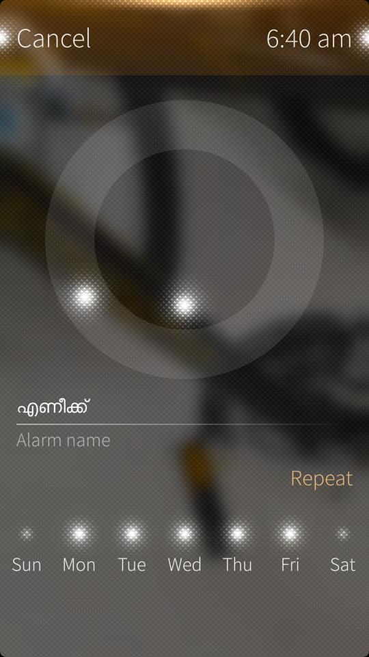
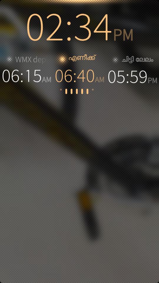
This patch will change the Clock week start day to Sunday for Alarms.
Screenshots:
Category:
Application versions:
| Attachment | Size | Date |
|---|---|---|
| 3.43 KB | 28/02/2015 - 23:39 |
Changelog:
* Fri Jan 27 2015 Aby Z Thomas <AbyZThomas@gmail.com> 0.1-4 - Initial build
Comments
Schturman
Fri, 2015/03/06 - 14:43
Permalink
Thank for the patch, like it!
But can you please centralize the dots below the ckock for 24h users ?
It's too much on the left side, see image:
http://i.imgur.com/FgTbpOd.png
Thanks
abyzthomas
Sat, 2015/03/07 - 22:42
Permalink
Hi Schturman,
I haven't found a way to figure out the 12/24 hr setting from here to accomplish this so it will look okay with both users. If I move, then it looks really ugly for 12hr users.
I can increase the left margin and push or increase space between the rectangles. Which one do you is better?
Schturman
Sun, 2015/03/08 - 00:54
Permalink
Thanks for answer.
If it's not possible, it's ok like as is, you don't need to do nothing ;)