Patch: force cover size in application switcher (was: force large covers)
As the new SailfishOS UI's application switcher is now vertically scrollable, it's now finally possible to force the large covers while being able to multitask with more than four applications.
This patch does that, alongside some other tweaks that improve the experience in this particular case:
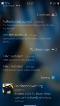
- The status bar sticks at the top even when scrolling through the open applications.
- The status bar background is more prominent, easing its readability
- The application switcher doesn't scroll to the top anymore when peeking/returning to the home screen.
It's also possible to force the Small covers instead of the Large ones.
New in version 3.0.0.5-1:
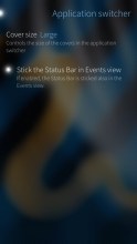
The Status Bar can now be stickied in Events view, too.
New in version 2.1.0.11-1:
It's now possible to choose the cover size behaviour (dynamic/large/small) from the Settings application.
Works on SailfishOS 3.0.0+.
Category:
Application versions:
| Attachment | Size | Date |
|---|---|---|
| 12.46 KB | 14/06/2020 - 21:27 | |
| 12.38 KB | 02/11/2019 - 01:11 | |
| 12.28 KB | 02/11/2018 - 16:05 | |
| 7.27 KB | 08/04/2017 - 17:41 | |
| 4.62 KB | 25/10/2015 - 17:19 | |
| 4.15 KB | 06/09/2015 - 19:53 |
Changelog:
* [data] patch: updated for Sailfish OS 3.3.0.14 Rokua (Thanks to Arno Dekker)


Comments
carlosgonz
Mon, 2020/06/15 - 00:50
Permalink
Thank you. You always create good patches, like Meego OS
timeral
Thu, 2020/04/16 - 15:44
Permalink
Could not be patched on Sailfish OS 3.3.0. Hope to be fixed.
ade
Thu, 2020/05/21 - 11:01
Permalink
Just created a pull request: https://github.com/g7/sailfishos-patch-force-largecovers/pull/4
ade
Sun, 2020/06/14 - 12:14
Permalink
There seems to be no interest in merging my pull request for now, so I uploaded a modified patch for SailfishOS 3.3.0 to the patchmanager webcatalog.
eugenio
Sun, 2020/06/14 - 13:00
Permalink
I'm sorry, I've overlooked both openrepos and github notifications :|
Thanks for your contribution, will merge soon-ish.
Serega_xDD
Fri, 2018/11/02 - 03:27
Permalink
Please update
eugenio
Fri, 2018/11/02 - 16:06
Permalink
Done :)
Serega_xDD
Fri, 2018/11/02 - 16:11
Permalink
Good, Thanks)
alina
Wed, 2018/05/23 - 10:13
Permalink
Feature request: Can we have the same behavior, i.e. static status bar, on Events view as well?
eugenio
Fri, 2018/11/02 - 16:07
Permalink
The new version (3.0.0-5) now permits to stick the status bar in the events view, too. It must be enabled in Settings -> Application Switcher.
Enjoy :)
alina
Sat, 2018/11/03 - 11:05
Permalink
Yeah, I read the changelog. ;) Thank you for the update.
To be honest, I replace the overlay color with highlightDimmerColor. Do you possibly know a way to replace overlayColor with highlightDimmerColor system-wide?
alina
Sun, 2018/05/13 - 18:05
Permalink
Thank you for the great patch, and the great update. I was using the simple version for years. With new features it is a must-have now.
Markkyboy
Tue, 2017/09/19 - 22:52
Permalink
Nice! :)
Just486
Tue, 2017/07/25 - 15:30
Permalink
Please, I beg, solve the conflicts with Ultimate statusbar patch (or integrate functionality), I really want to use both!
olf
Sat, 2017/06/24 - 07:11
Permalink
The Patch "Force cover size" conflicts (when applying in Patchmanager) with "Ultimate statusbar patch" (and vice versa).
I wonder, if this is really technically necessary, as they are patching quite different areas of the SFOS UI (the statusbar vs. the application switcher).
I would love to see them playing together nicely, but now that I have to make a choice, the richer functionality of the "Ultimate statusbar patch" is convincing.
Tested on a Jolla 1 phone under SFOS 2.1.0.11 with the recent versions of "Force cover size", "Ultimate statusbar patch" and Patchmanager2.
*Edit:*
Oops, still have an entry "Application switcher" in the SFOS settings with "Ultimate statusbar patch", where one can force the cover sizes. So yes, there is clearly an overlap in functionality, hence a conflict when applying these Patches in Patchmanager is logical.
Looks like the integration of this functionality was forgotten to be mentioned on the OpenRepos page of "Ultimate statusbar patch". Sorry for my confusion.
*Edit 2:*
Ah, after a reboot the entry "Application switcher" in the SFOS settings is gone. Obviously I forgot to restart Lipstick or so.
Thus I am back to the original question:
Why do these two Patches have to conflict at all?
*Edit 3:*
Mmh, after reading the description of this Patch more closely, I suspect the "some other tweaks" (of which two tweak the statusbar) actually do not "improve the experience in this particular case" ( ;\ ), when trying to use "Ultimate statusbar patch".
Hence @eugenio, please make "Force cover size" compatible to "Ultimate statusbar patch", so one can use them together.
*Edit 4*: Apparently only the feature "The status bar background is more prominent, easing its readability" of "Force cover size" conflicts with "Ultimate lockscreen patch" (have not investigated that technically), so the easiest approach may be just to remove this feature, as it is not related to the primary aim of "Force cover size" (in contrast to all other features it provides): To enable enforcing the cover sizes (to be always "small" or "large") and improve the usability of the application switcher, when many applications are open.
malibu
Sat, 2015/10/24 - 17:15
Permalink
Very usefull patch, waiting 2.0.0.10 update :P
Thanks for this patch, news covers actions with little covers are really crappy.
eugenio
Sun, 2015/10/25 - 17:19
Permalink
Latest update should work on 2.0.0.10 :)
malibu
Sun, 2015/11/15 - 22:23
Permalink
Maybe this bug is related to your patch.
See : https://www.dropbox.com/s/3owbhcxen6yg29l/15110002.mp4?dl=0
Doesn't appear anymore since i disabled this force large cover patch, but i'm not sure atm.
Hope you can see it, i loved this patch :)
panta
Tue, 2016/01/12 - 22:07
Permalink
I can reproduce this bug on Sailfish OS 2.0.0.10.
Applied patches:
- Enhanced Lockscreen
- Quick settings on power menu
- Restore swipe to lock
- Character count in SMS editor
- Notes app cover
- Voice call combined patch
- Return to old pulley menu
eugenio
Thu, 2016/01/21 - 01:23
Permalink
I tried your same combination but it seems to work fine.
Running 2.0.1 at the moment, so please check if it happens again with this new OS update.
eugenio
Tue, 2015/11/24 - 03:20
Permalink
Sorry for the late reply :)
Never seen a bug like that. Which other patches have you installed?
malibu
Thu, 2015/11/26 - 18:43
Permalink
For patches i got, see : http://e84.imgup.net/patches6899.png
I didn't saw this bug since i disabled your patch. ( 2/3 weeks now i guess, with patch applyed, this bug happened to me something like 5+ time by day. ) Maybe it's a patch combinaison bug ..
Let me know if you want that i try something for you.
malibu
Sun, 2015/10/25 - 17:35
Permalink
Thanks a lot .. :)
stephan
Thu, 2015/09/24 - 20:12
Permalink
Nice, I gues I like big covers , amongst others it makes tapped cover actions easier.. Thanks. Jolla should of course include this as option (set max row of covers 2, or 3 in portret)
Jordi
Sun, 2015/09/06 - 20:55
Permalink
I did not install ver. 1.1.9 but I like the improvements you propose : I will install your patch ASAP!