Patch: PullDown Covers
For SailfishOS version 1.1.9.28 only!! DON'T FORGET TO REMOVE THIS PACKAGE (NOT JUST THE PATCH IN PATCHMANAGER) BEFORE UPGRADING TO A LATER VERSION!
Here is the first version of the PullDown Covers patch.
First, some background - after hearing about the changes in cover actions, in the beginning of this year, I was thinking about ways to solve the problem with tiny buttons and the lack of gestures. One of my first thoughts was adding a pulley menu, which would be already familiar to the users and would create greater consistency with the rest of the system (I love the original pulley menu gesture and there's nothing better, but it was the only place in the system where such gesture was used). I did some mockups in QML, but it didn't really work well. Now that Sailfish UI 2.0 is available for testing, I could finally:
- see how big of a problem the new cover gestures are
- try patching the system
So here it is.
Changes:
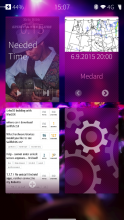
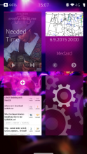
- added a pulley menu (together with a needed SilicaFlickable and Rectange for cropping)
- original cover action buttons set to disabled
- cover action icons' opacity changed to 0.5 (to show that the buttons are inactive)
Warnings:
- use on your own risk. It may break your system, so don't blame me if it does :) It works well for me, though.
- it works only on SailfishOS version 1.1.9.28
- once you have more than 9 apps open, it may interfere with scrolling. I may add means to prevent this in the future, but for now, it is just up to you how many apps you have open
- it is now bit harder to open the menu, as you cannot scroll on the app covers - either scroll in between covers, or swipe from the bottom of the screen to access the menu
Planned:
- think about reversing the order of the items in pulley menu
- settings page?
If you like this patch, please consider a small donation:
Category:
| Attachment | Size | Date |
|---|---|---|
| 5.19 KB | 23/10/2015 - 15:04 |
0.4 - Allow reordering covers by moving them around, as introduced in 1.1.9.28.
0.3 - Remove original MouseArea altogether, to allow triggering the pulley menu even from the bottom area of the cover
0.2 - Initial version


Comments
DrYak
Fri, 2018/11/09 - 15:59
Permalink
As of Sailfish OS 3.0.0.8, it doesn't apply anymore
Vermut
Fri, 2015/09/11 - 14:28
Permalink
Hi! When I pull all way down on one action app (Messages for example), it just shows the pulley menu and waits for selection.
Is it possible to always execute that one action even if I pulled all down?
nodevel
Fri, 2015/09/11 - 18:18
Permalink
Hi!
Yes, it is possible and easy to make. I'd prefer it too, but I think I'll make it an option, because some people told me they like the possibility to pull the menu down and then click it.
jendkers
Thu, 2015/09/10 - 14:38
Permalink
Hi!
Very cool idea to reimplement cover actions! I like it, but it needs more work.
Can you make that swipe up on cover will trigger app grid like it's working on background image? Second thing is that sometimes cover needs to be pressed once to get pulley working.
Good work!
gedeon
Thu, 2015/09/10 - 14:35
Permalink
HI
Nice work, but I have a differen idea with this function. I think so not bad the original basic function (at least for me), but the original application to close method is little bit slow (long tap and closing with the bottom X ...) , but this pulldown function will be good for app-close on home screen.Just quick pull down on the little app window and immediatly will be closed... I think so not need pulley menu, just the pull down gesture for the quick easy to close.
Can you code(ing) just this function type of patch? If you can, thx. and I'm waiting for it! :)
(sorry for the bad english)
jonkha
Tue, 2015/09/08 - 21:08
Permalink
Great work! I noticed that the pulley menu doesn't work before you have once touched the app cover. Otherwise it is working flawlessly.
nodevel
Tue, 2015/09/08 - 21:58
Permalink
Hm, you're right I didn't noticed that. It looks like you need to need to touch it just once in the beginning, though.
I'll trying looking into that, but I'm not sure if it is fixable.
J0114sailor
Mon, 2015/09/07 - 13:56
Permalink
awesome patches man! I have one suggestion: is it able to make patch which disables black screen behind app list? (so apps would be over wallpaper) And is it able to change the size of a icons in 1.9.x/2.0 (because i really loved those little icons)
Thanks!
nodevel
Tue, 2015/09/08 - 22:00
Permalink
Hi,
thanks! I might try looking into the first suggestion (no promises, though), but I'll leave the second one to someone else, as I would not use that patch (decreasing size of menu icons) myself.
HtheB
Mon, 2015/09/07 - 04:38
Permalink
Thanks for the great patch!
Can you also bring back the old sailfish cover actions?
That would be really great !
nodevel
Tue, 2015/09/08 - 22:02
Permalink
Hi,
well, I'd need to get hold of version 1.1.7.x first to see how it was done... But I am seriously considering resetting back to that version (not very happy with 1.1.9.x), so once I get the tablet, I should be able to have both 1.1.7.x and 1.1.9.x alongside and go from there :)
malibu
Sun, 2015/09/06 - 19:40
Permalink
Thanks for this patch. Can't wait to test it !
Can you add a settings for set up the opacity of inactive buttons ?
nodevel
Sun, 2015/09/06 - 20:03
Permalink
Hi, thanks for your comment!
I definitely plan on doing so, after I learn how to make settings pages :) However, if more people think that the opacity should be different (1.0, maybe?), I can even change it in the default version.
malibu
Sun, 2015/09/06 - 21:29
Permalink
Hey. Just upgraded to 1.1.9.28 and tested.
The idea is okay ! But i don't understand why you want to keep opacity, just for remember the action ?
IMHO i would suggest to hide it completely if we can't set it up.
For me the best way to use it is to opening fully the pulleymenu and then click for the desired button, it's a little bit longer, but the classic buttons seems to be very little when more than 4 apps are opened. Or maybe it's better to keep the buttons working too, because you can't see them if you open the pulleymenu ..
And maybe your pulleymenu system can support more cover action. 2 Actions is really little, like on media player, you can't go to the previous track .. so bad !
Hope you'll understand my great english \o/
nodevel
Sun, 2015/09/06 - 22:13
Permalink
Yours English is fine :) Thanks for your message!
Why do I want to keep the icons (just with reduced opacity) there? Well, if I remove them, there will be just a blank space, without any use. When the icons are present, they at least serve as an indicator of which actions are present and in which position in the pulley menu they currently are. I am open to suggestions how else to indicate this, but I would like to see on the first sight which actions I can perform, without going to the pulley menu.
Yes, you're right, that you can just open the pulley menu and tap there - it's a nice functionality indeed :)
I won't be keeping the buttons, though - in my opinion, they are in the worst possible place and I often tap on them without intending to do that (see my criticism here). Therefore I think that removing the buttons without any alternative is actually better than keeping them - but I am suggesting an alternative approach with this patch.
More than 2 actions are possible and there is no limitation in my patch - it's just up to the developers how many cover actions they'll add.
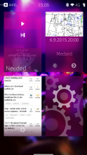
Here's an example with 3 cover actions :)